This post will outline some of my efforts to bring social networks into dialog with geography. Although I have found some interesting plugins and hacks, the results still leave something to be desired.
 To provide some background: From my dissertation I have a nice, interactive map of all garrisons (phrourai, in orange), and garrison commanders (phrourarchoi, in white) from all of Greek sources up to the mid second century C.E. This is all nicely georeferenced, linked to other projects such as Pleiades and Pelagios, and serves its purpose pretty well. However, this provides the location and frequency of garrisons and commanders, and does not really show the social network that developed between commanders, monarchs, and communities. I could perhaps use a clustering strategy to create dynamic markers around specific points, but that seems to be a very unwieldy solution.
Strictly speaking, by modeling people (phrourarchoi, monarchs) with places and abstract communities I am moving beyond a social network and instead looking at an information network, as I am interested in a number of different connections (social, geographic, ideological) that are not traditionally associated with social network analysis.
The first step to get all of my data into Gephi, assign different “types” to my nodes (in my case people, offices, places, phrourarchoi). I then created a network map, ran statistics, assigned the node size based on degree, and ran a force atlas layout. At the same time I also color coded the network based on type. This is all pretty basic Gephi use so far, and produced a perfectly serviceable network graph.

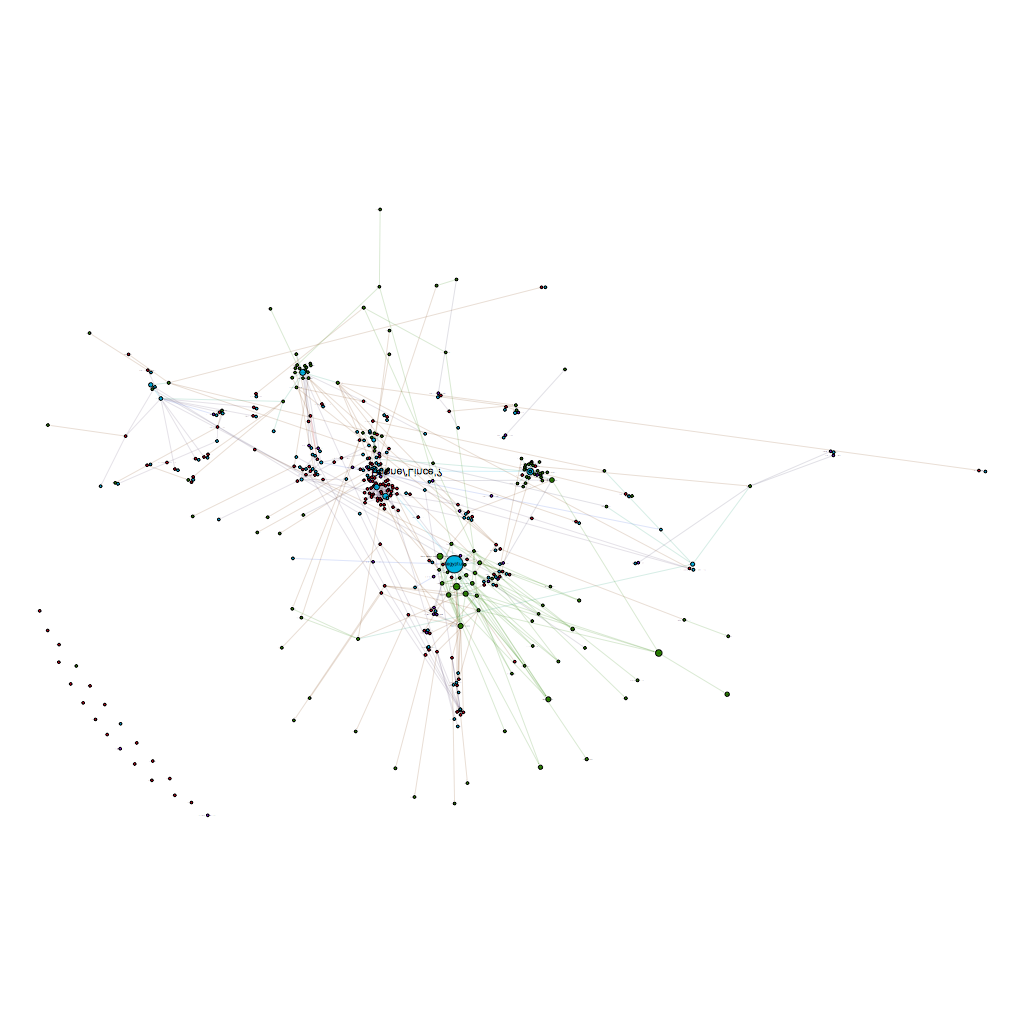
Now it was time to experiment with different types of ranking. Betweenness centrality, or the measure of a node’s influence, led to an interesting difference in graphs:

However, this result is somewhat meaningless, as my graph covers a period from the 400s BCE to the 100s CE. Despite any of his wishes to the contrary, Ptolemy VIII did not live forever, yet he is the unquestioned central authority of this graph. All of the other Egyptian monarchs also score highly, underlining their importance in the communications and relationships between different phrourarchoi. This is an interesting yet hardly unsurprising finding – a good portion of the surviving data on phroruarchoi originates from Ptolemaic Egypt, which may inflate the relative importance of the dynasty in this kind of analysis. What this map does show is the enormous influence of individuals – most of whom were not phrourarchoi themselves.
However, I am interested in garrisons as a sustained phenomena across several centuries, so I want to get back to the importance of location and geography on garrisons. In other words: Where are the most important locations for phrourarchoi, and how do those relate to one another?
Running an Eigenvector Centrality measurement produces a graph that somewhat mimics my original map, with physical locations, not people as the most significant authorities. This gives a better impression of what I am looking for – the centrality of a node relative to the whole network, which in my case privileges locations, which often serve as a bridge between different populations of nodes.

To me this is an interesting graph: It shows the importance of locations, while still highlighting important individuals. Now that I have this graph, I would love to place it on a map. I actually have coordinates for all of the locations, so a simple use of the Gephi GeoLayout plugin puts all of my identified places in a rough geographic layout.

From here I simply fixed the location of the places, then ran some other layouts to try and make a coherent graph of people and offices that did not have a specific geographic value.The results were generally less than satisfying. The individuals in my dataset are not assigned coordinates because it would make little sense to do so – some phroruarchoi served in multiple locations, and almost all imperial phrourarchoi served outside their place of origin, were buried somewhere else, possibly lived in yet another location, etc.


From this step, I thought I would try out some Gephi plugins to push my data into a format I could drop onto a map. Only a very small percentage of my nodes actually contain geographic information, so the ExportToEarth plugin was not going to help. My first attempt at pushing out a shapefile using Export to SHP initially looked like a success in QGIS:

So, I decided to throw in some background, and that is when the trouble started. QGIS does a good job of transforming coordinates, but this was just messy (and not to mention wrong – there certainly were no phrourarchoi in Antarctica!)

So, what happened? If you do not have coordinates already explicitly assigned to your data, Export to SHP actually does not use “geographic” coordinates, and instead uses, in the words of the plugin, “fake geography – that is the current position of the nodes in the Gephi layout”. My thought that this position would line up with correct coordinates fromGeoLayout were false –Export to SHP treats the middle of the map as an origin point (instead of using whatever geographic data is present), and as such it does not match with any projection in QGIS.
This is a bit of a let down. It seems that all of mapping plugins in Gephi need for *ALL* of the nodes to have geographic information already baked in, or they will not export a geographically accurate map. This does make some sense, but it would be nice if you could use GeoLayout to place nodes with actual geographic data, then use force atlas or some other layout to produce a graph, and finally use the location of those nodes as coordinates. In other words, the location of nodes on the graph that have no actual geographic data of their own are located relative to nodes that do have geographic data. I tried the Sigmajs exporter, but the json object also does not use real coordinates, as seen in the fragment below ( lng and lat are the real-world coordinates, while x and y are used by SigmaJS):
"label":"Priene/‘Lince’?",
"x":-22.65546226501465,
"y":32.66741943359375,
"id":"Pl_599905",
"attributes":{
...
"lng":"27.297566084106442",
"lat":"37.659724652604169",
...},
So, is there a way around this?
Short of writing a new plugin to do so, it looks like Gephi is simply missing the functionality of assigning geographic points to nodes that do not already have that information, then exporting that graph in a way that makes sense to mapping software. I could export an image and georeference that, but that will not provide the functionality I am looking for either.
What I would like is for a graph produced by Gephi to use coordinates for nodes that have them, and make real world coordinates for nodes that do not. This map could then be placed on Leaflet / OpenLayers / whatever map, providing a level of interaction beyond a static image. As it is impracticable to duplicate the functionality (especially the statistical tools and layouts) of Gephi in a mapping application, this strikes me as something that would be very valuable to visualization and study.
My next idea is to see if R has something close to what I want, which I will detail in a future post.

1 thought on “Networks, Geography, and Gephi: Lots of Promise, but Lots of Work to be Done”